Trader Joe’s
IA Audit/ UI Redesign
I conducted user testing to preform an Information Architecture Audit as well as a UI Redesign for the website of grocery store chain, Trader Joe’s
Design, Research, Writing Storyboarding, User Journey, Illustration
Tools Figma, FigJam, Adobe Illustrator, Google Drive
Problem Space
E-commerce is a massive element in our culture, as are memorable and iconic brands. If Trader Joe’ web presence has ease of use and clear flow, then their loyal customer base may be even more compelled to engage with their products. I used design thinking to discover the pain points of their current site to offer a solution, via a redesign of it’s appearance and navagation
Background
My relationship with Trader Joe’s has been life long. I was born and raised in California, where the stores seem to dot each and every neighborhood.
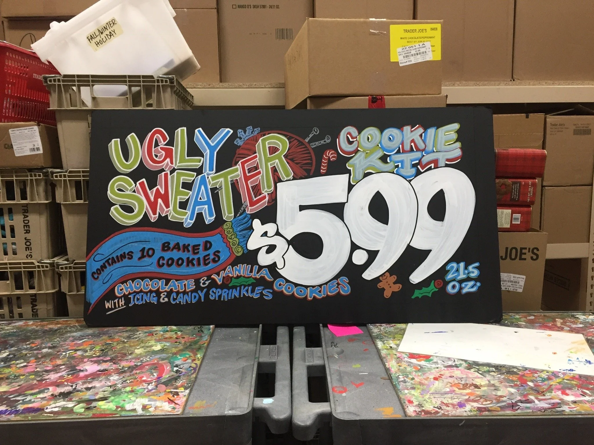
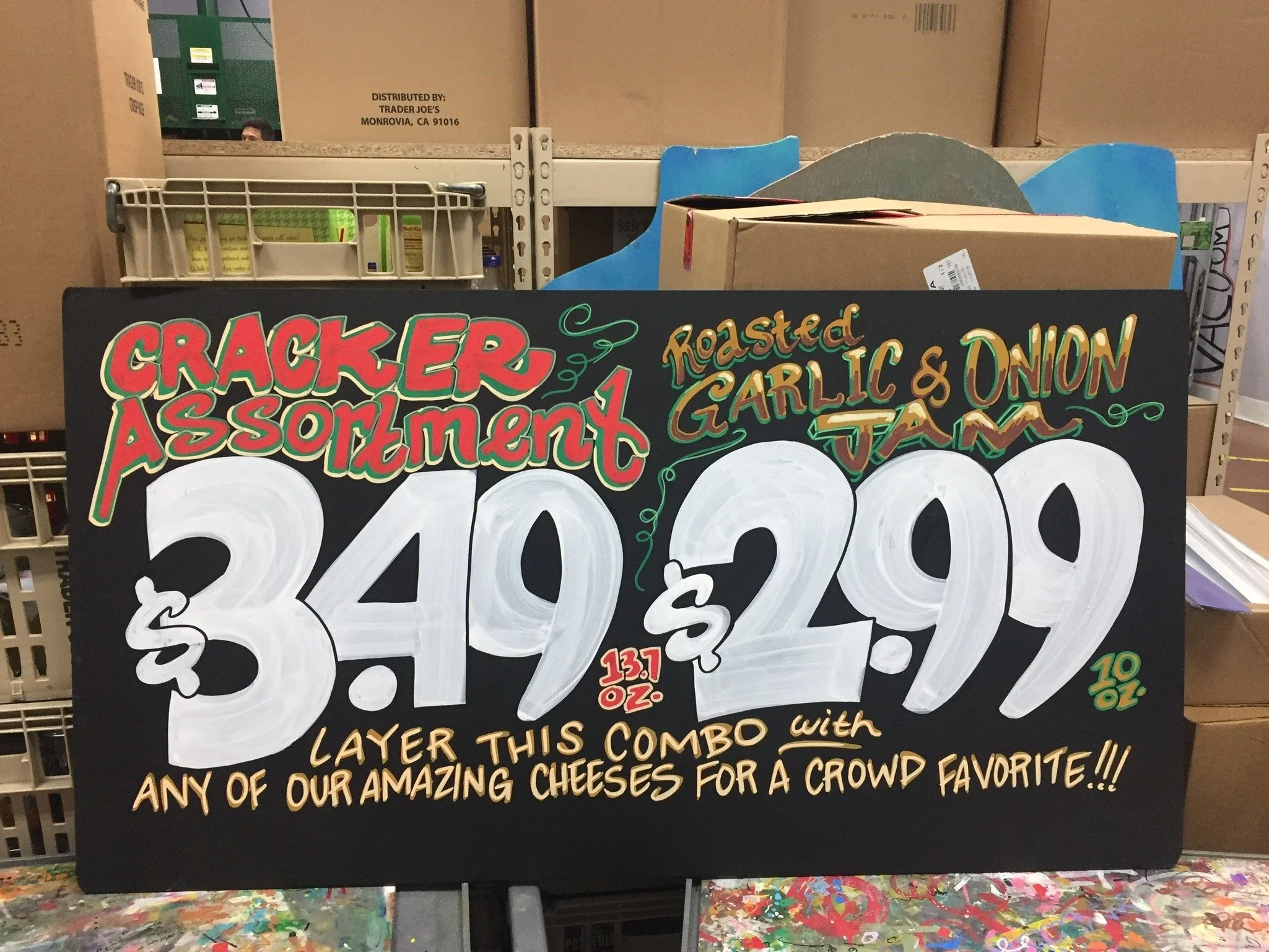
Straight out of high school, my very first job was as a Trader Joe’s crew member. My dream was to join the in-house art team and paint signs for 8 beautiful hours a day. I eventually worked my way in there, through careful leveraging.
Here is where I learned that Trader Joe’s has a $0 advertising budget. Zero dollars. Instead they invest in in-house art teams like the one I was on. I found this to be fascinating and powerful, much like phenomena of the brand itself. I worked there for nearly 5 years and in two different states. The methodologies and practices of the business remain impressed upon me to this day.
Fast forward 12 years later to 2025. I have embarked upon a new career in UX Design. I could not imagine a better subject for UI analysis and redesign.
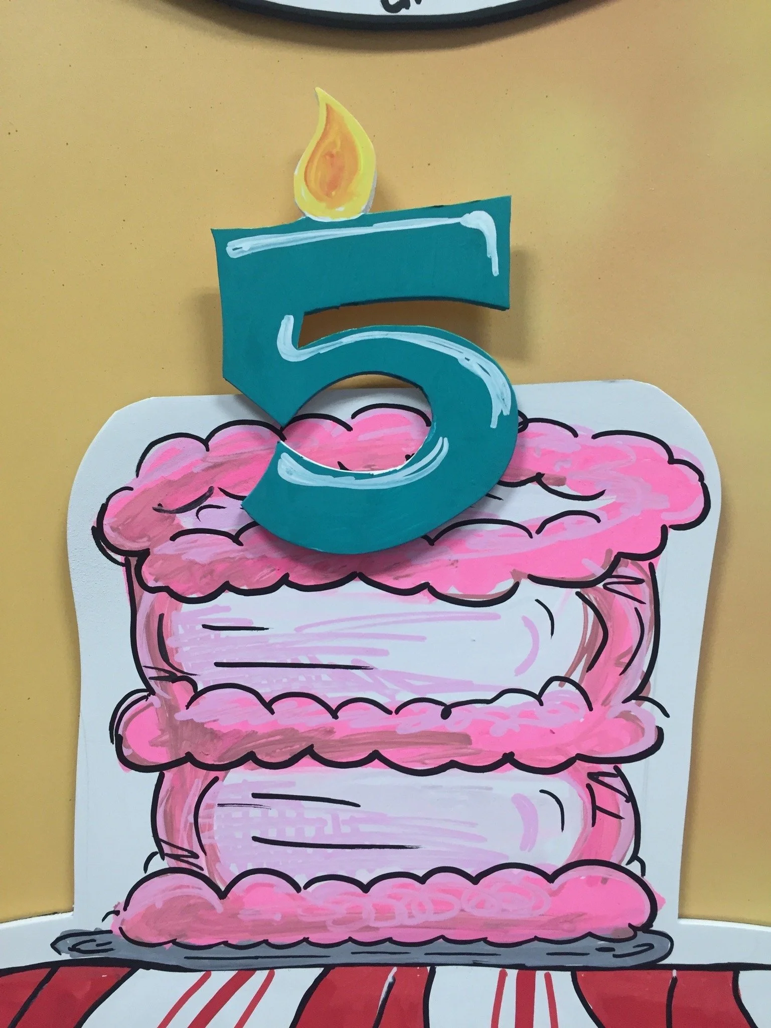
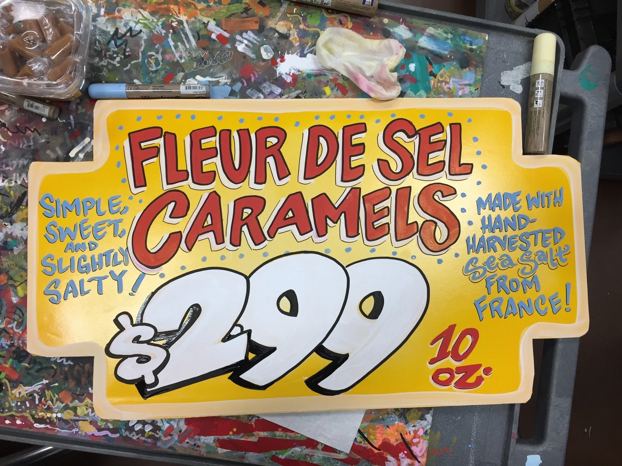
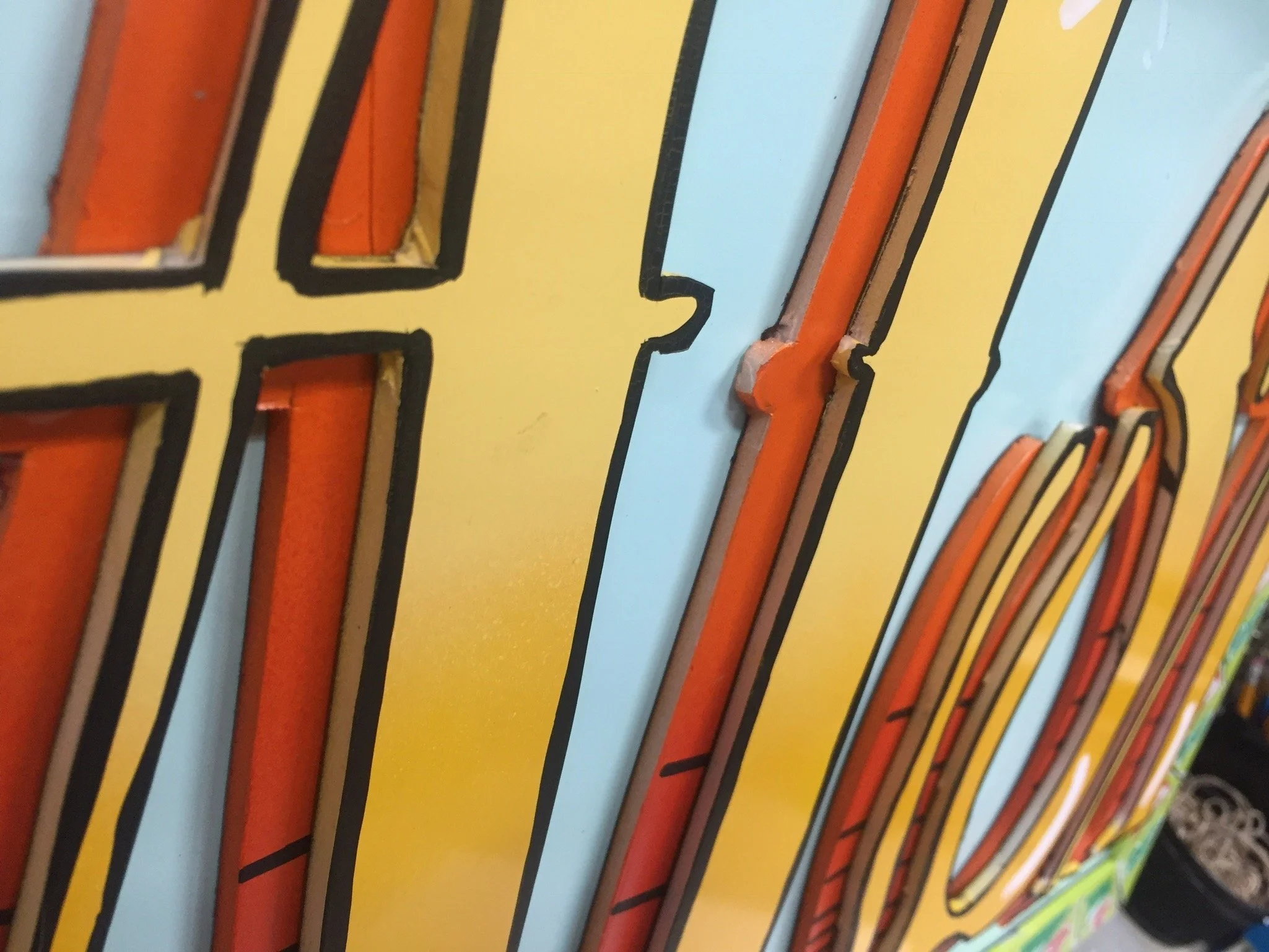
Some samples of my Trader Joe’s sign painting
User Testing
I conducted 5 separate user tests on the site’s 4 current stays of navigation. I summarized some of my favorite notes below:
Primary Nav (Hamburger)
“Products” are organized similarly to how they are in- store. Matches real life!
“Guides, Stories, and Entertaining” are virtually indistinguishable from each other, needs to be reworked, aesthetic and minimalist design
It is not clear what “Listen” is leading the user to- is it to stream music, is it a podcast, are they selling CD’s? Recognition and visibility
“Find a store” is not the same terminology as “stores” in the UltraNav. Would be better if they were called the exact same thing for consistency and standards
Every button responds to hovering cursor, helpful to user- shows system status
Footer Nav
“listen” is consistent with the hamburger and banner. But this is the first time they ever plainly say the word “podcast” which is not consistency
“Who we are” combines what we see in the “about us” in the UltraNav, and some of the other things we see in ‘Announcements” diversity & inclusion
“Locations by state” has the same effect as “stores” in the UltraNav, its just laid out as 50 different buttons instead of a search. Is this necessary? Recognition rather than recall
Supplementary Nav (Banner)
I believe this banner nav (which in the initial usability tests of this site, the majority of users primarily gravitated to), is meant to be easy access to the “stars” of the entire hamburger nav. It contains everything from inside there except “About Us” and “Find a Store”
“Discover” is not super clear. A user could easily interpret that as discovering a new store, especially with the compass icon- Recognition rather than recall, Matching system w/ real world, efficiency of use
Why isn't the entire hamburger nav just condensed into this banner? It would need two more icons added to it. Maybe this would feel less redundant? Aesthetic & minimalist design/ consistency?
Ultra Nav
I would have the “my store” be slightly more specific, as many cities have more than one Trader Joe’s location and it could be showed more immediately, Visibility and recognition
I don’t know if it is necessary to have a “my stores” tab. Are we assuming that the users are curious about stores that aren’t in their area? One benefit is that you’re able to discover the addresses and hours of operation of other locations. Not every location is able to sell alcohol/ liquor etc and you can see which is which- aesthetic and minimalist design
Every button reacts to the cursor hovering, except “My Store”, why? visibility of system status
Problem Statement
Trader Joe’s chooses to not engage with any e-commerce, including grocery delivery apps or services. Maintaining complete control over their stellar reputation for customer service is vital. Their website is not a store it’s merely a container to show what is in the store and ideas for what to do with those things. It is a sentimental and instructional function. Users liked the shopping list feature. I am proposing to keep that on the website but also create a mobile app whose primary function is a shopping list. I am dually offering a solution in the form of a visual update and a reorganization of the site’s navigation.
Trader Joe’s never does sales; there would be no monetary advantages. It would merely be a shopping list, a very simple tool for organizing groceries needed for optionally different purposes. A companion to the website, in line with Trader Joe’s core branding values of simplicity as a means of efficiency.
If Trader Joes’ digital products can serve their customer base in a seamless and effective way, they might be able to increase engagement while also keeping their core values prominently featured.
Heuristic Evaluation
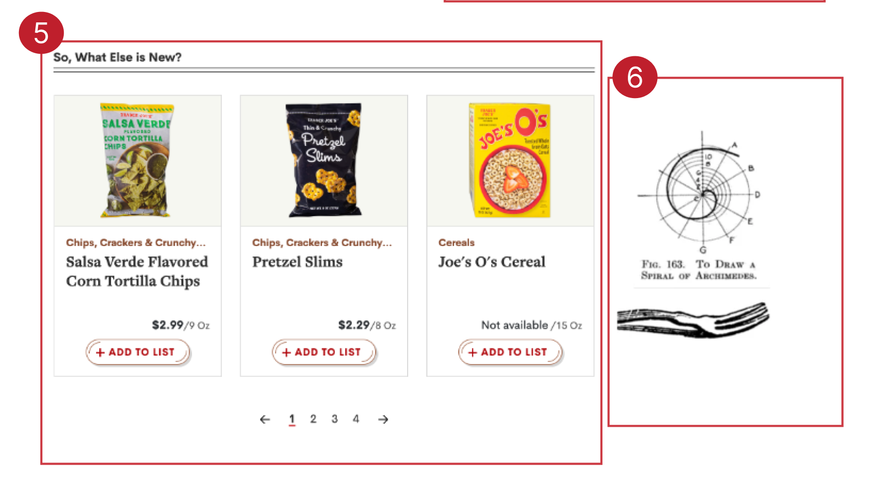
The first step in my plan of action was to conduct a heuristic analysis of the site’s current navigation. I found there to be a lot of redundancy in the global navigation. The appearance of the site’s content was inconsistent.
I liked the idea of highlighting new items, but thought there may be a more impactful way to to do it. It isn’t an e-commerce platform, you can’t buy anything. What is the intention behind the site’s current functionality and what can be done to further improve that vision?
1. What demographic would need to look the Fearless Flyer up online if they can just grab one in the store? What demo prepares for grocery shopping like that? Is this intended for people who live outside of the vicinity of a Trader Joes? What would actually be useful for an out- of- area Trader Joe’s lover to see?
2. Misaligned recipe cards look messy
3. Photos are low quality - don’t match the same vibe.
4. “discover more” button is vague and also appears to be floating in space with no context. Discover more what?
5. New items are displayed at the very bottom of the homepage. Exciting new items are a huge appeal of the brand, feels wrong that these are so buried.
6. Graphics have a cool vibe but feel random and are placed in a clunky way. They also appear a little grainy and out of focus.
Who is the intended audience?
What do they need?
Why do people visit this website?
Information Architecture
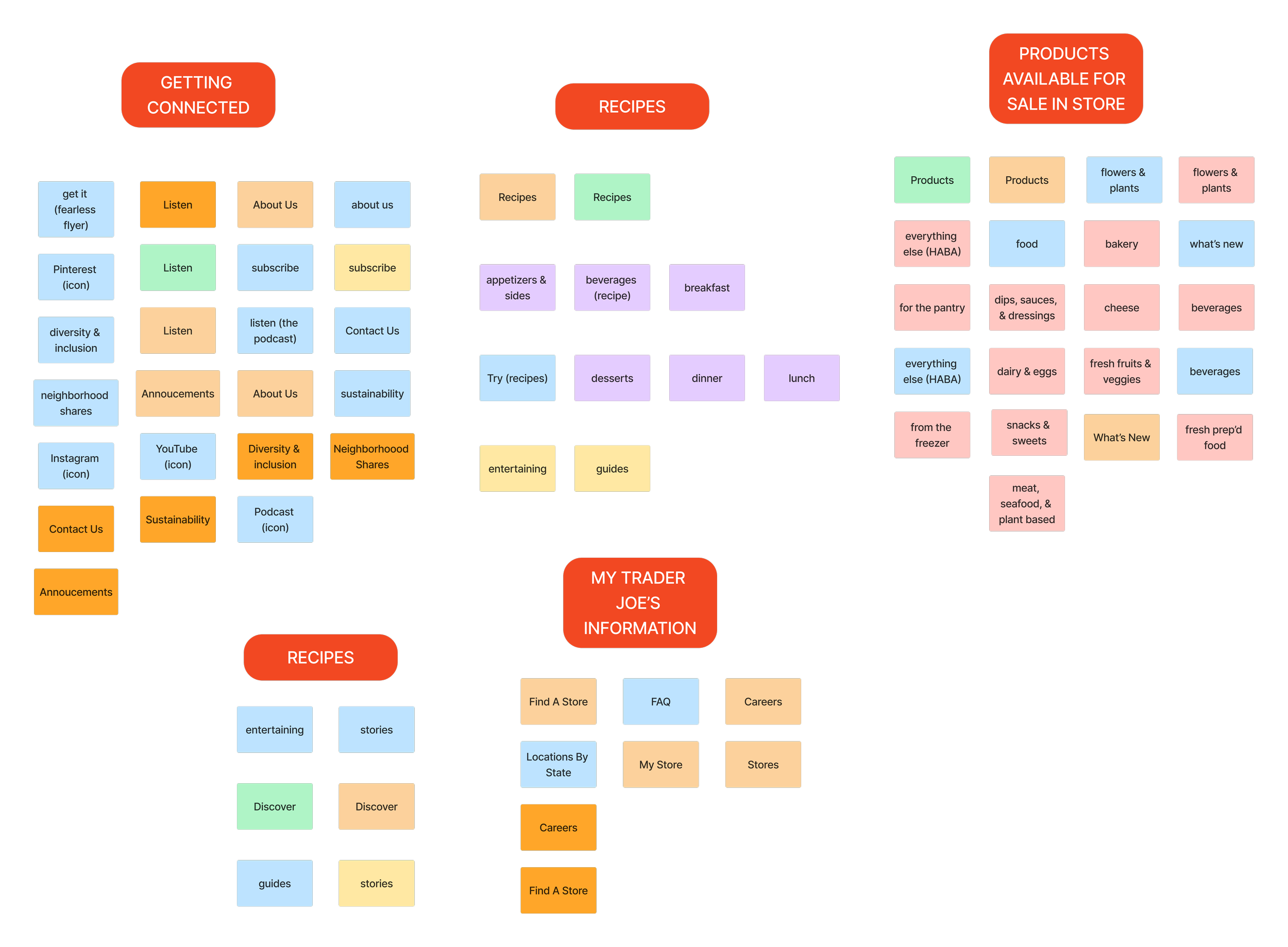
Before I could start to sketch out a new navigation, I needed to identify each individual element of the current nav. Seeing the cards all next to each other, fully homogenized with no clear hierarchy, really helps free your mind from the sway of what is currently in place.
I used card sorting to first map out the structure of the current site, and then the improvements I though could make it more effective. I have shown my solution here.
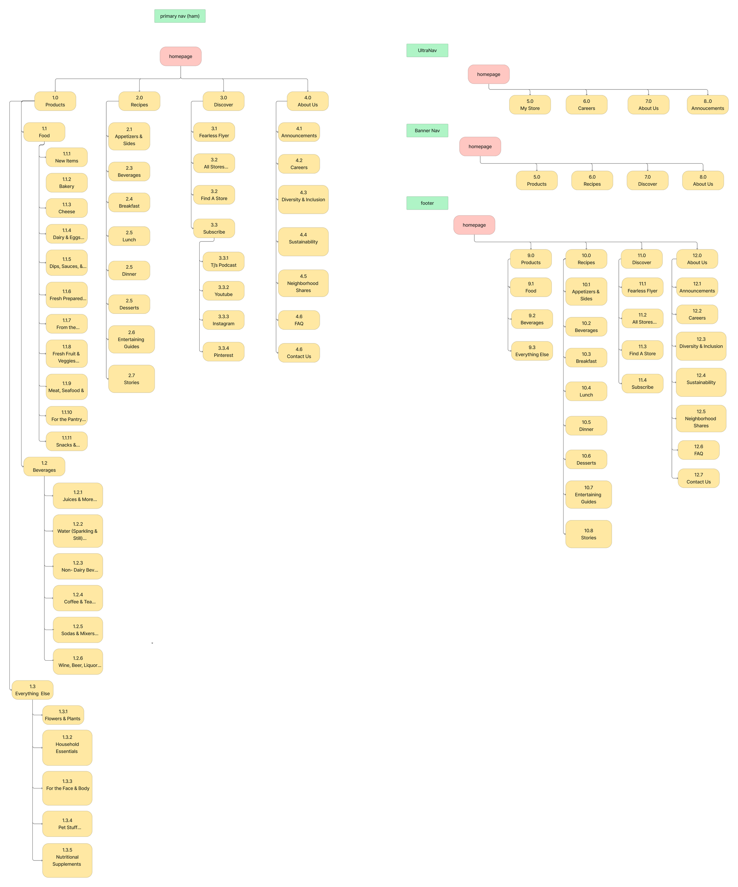
Sitemapping
From here I started to sketch out my new sitemap. Using what I determined in my card sorting to fill the sections of the navigation back in.
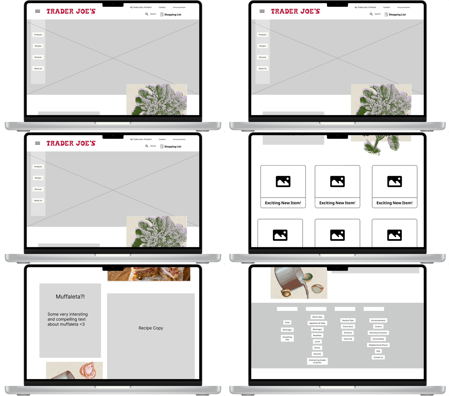
Lo- fi Desktop Wireframes
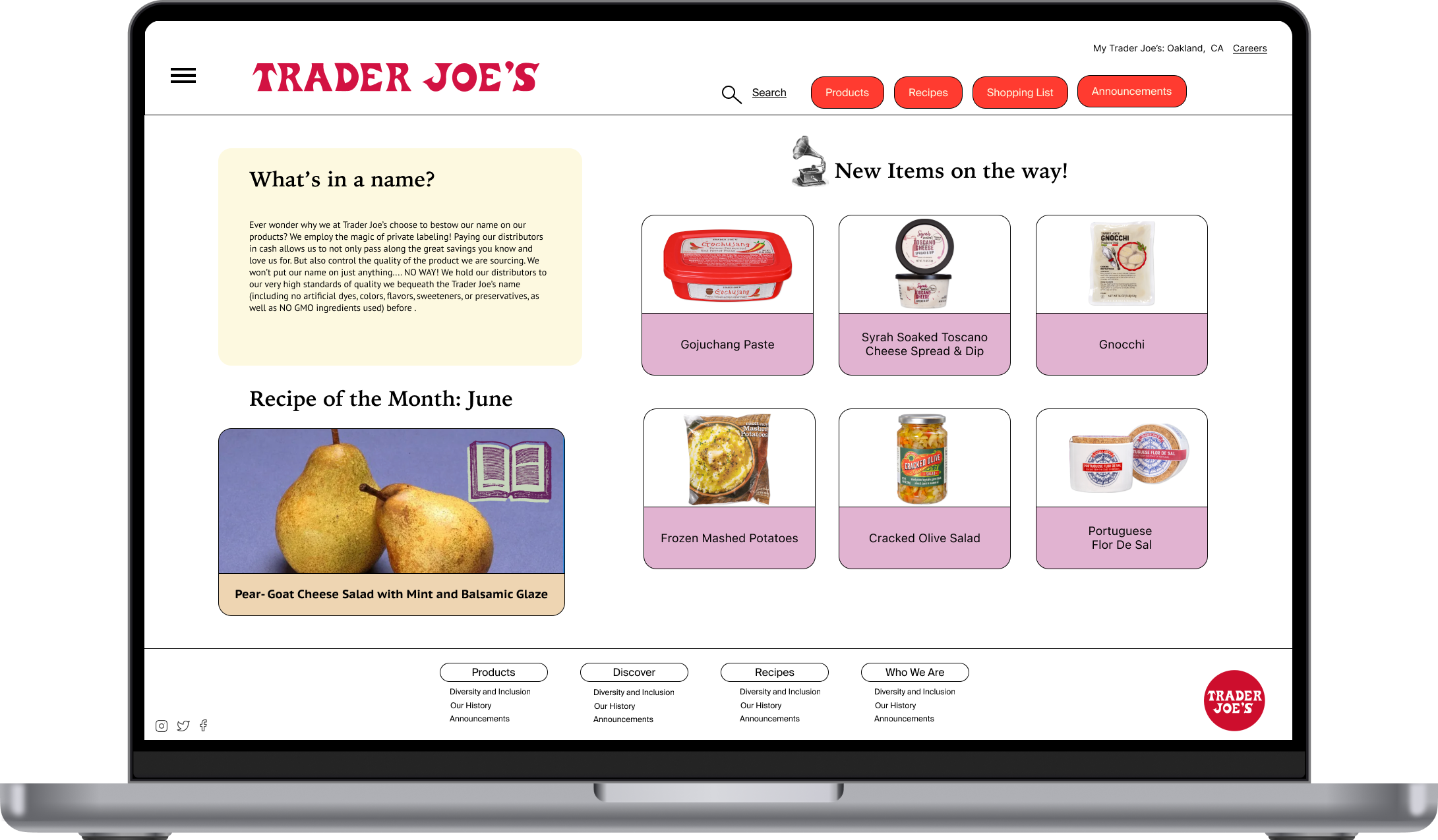
To begin wireframing a new Trader Joe’s homepage, I started with making some sketches in Figma. My plan was to implement my new information architecture. During user testing, I observed my subjects’ like of all four of the site’s current navigational systems. It was merely the organization of the information inside that was vexing.
My plan was to make only subtle changes, like so—— to see the clickable prototype in Figma click here.
Mid- fi Wireframes
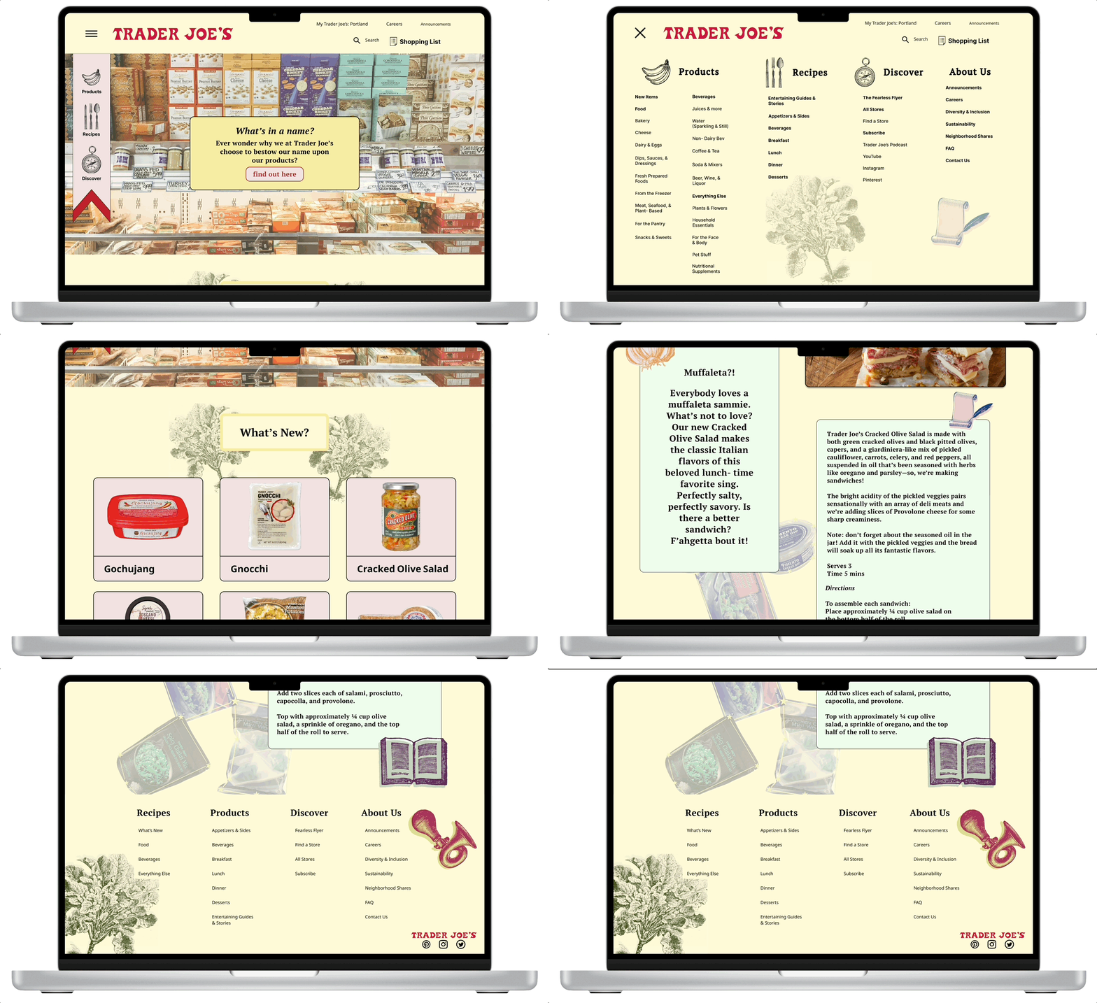
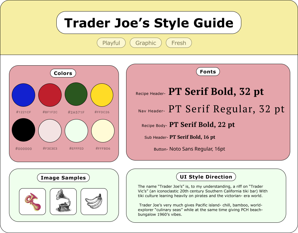
Considering Trader Joe’s distinct and recognizable branding, I sought to emphasize and compliment what they already have in my design approach. The navigation options received an update. I opted to keep their original structures mostly intact.
I drew tints and colors from packaging of popular products. Trader Joe’s visual branding is victorian era collage + meets 1960’s tiki bar + meets grocery store. I felt it important to retain that playfulness while introducing more graphic shapes and contrast.
Hi- fi Wireframes: Desktop
User Testing Insight
Testing my mid-fi wireframes was eye opening and caused me to shift directions a bit. My users started to sour on the banner navigation. It began to feel redundant. I determined the space would be better used to have a rotating blurb about the heart of who the company is and to shift the hamburger navigation to a smaller menu sliding out from the left. Sentimentality for the brand has been a prominent factor of all of my feedback so far.
I realized as did my testing subjects that there was still redundancy and that the visual direction, while retaining character and warmth, needed further polish. I kept things feeling pretty stripped back and implemented some “early- web” warmth, which feels consistent with Trader Joe’s ethos. I also pulled back some of the use of color to bring more emphasis to the products themselves.
To see my desktop wireframe prototype click here.
Mobile Shopping App Concept
As a companion to the Trader Joe’s website, a mobile app that houses the solution for shopping list needs may serve their users best.
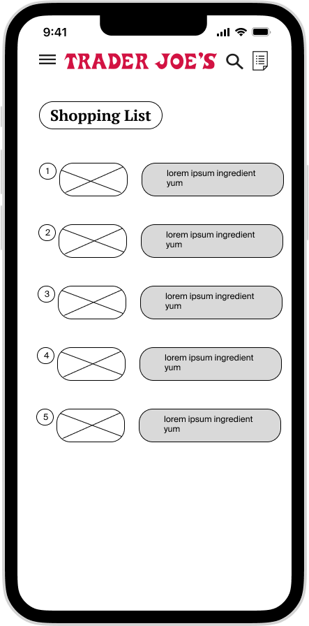
I reduced the amount of features on the mobile app to only those that would be relevant to a shopper getting ready to make a trip.
The Shopping List
Recipes
New Items
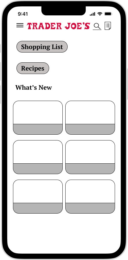
Lo- Fi Mobile Mockup
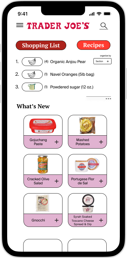
Mobile App Concept Highlights
Ability to arrange shopping list by the almost identical map of every store, type of product, recipe list, or price
Key features prominent on homescreen
New Items highlighted prominently so shoppers are aware of them while shopping
Companion to desktop design
Ability to search for items by name or description
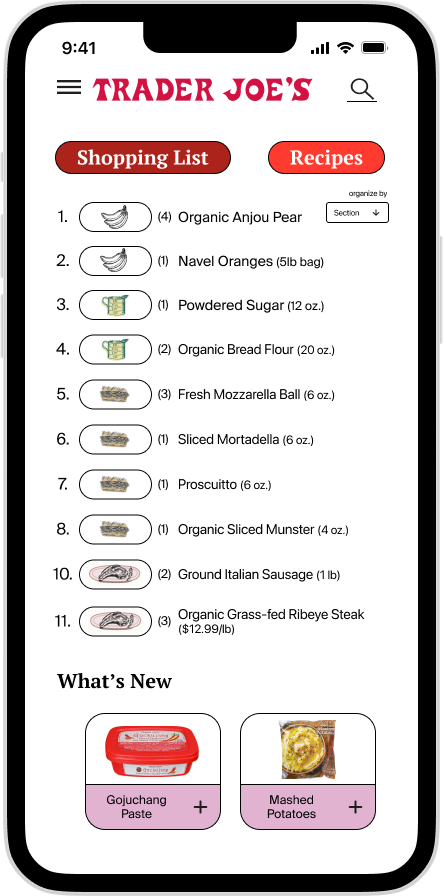
Hi- Fi Mobile Mockup
Shopping list items denoted with icons represented the section of the store it can be found in
In Conclusion
My goal in this project was to take what Trader Joe’s has and make it work better for them. I evaluated their site’s strengths and weaknesses. I used design thinking to conduct an audit of their information architecture and form my solution.
I really enjoyed working on this redesign. It is a fun challenge to try to get inside of the mind of a brand. I would love to take this study further, in ways the Trader Joe’s website might become even more of an asset to them. In wrapping up this case study I started to think about the nostalgia evoked from early 00’s computer games and the popularity of mobile puzzle games today. My next venture would be to gamify TraderJoes.com in the style of “Neopets”, “Club Penguin”, “MyScene”, or “Build- A- Bear”. The cult following their products carry could easily be translated to simple games. This could perhaps bring users maximum delight!


